#
Data Grids
#
General
All data grids in the system use a default layout showing all relevant data. Some special features of the data grids allow a customization of the layout and also a specific selection of data to be shown in the grid. Together with the option of saving and restoring customized grid layouts and settings, data grids can also be used for creating reports and exporting resulting data (e.g. to Microsoft Excel).
#
Sorting
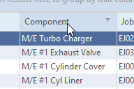
To sort the grid by a specific column, click the column header. Clicking the header again will change the sort order.
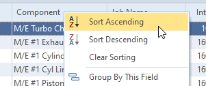
Data grids can also be sorted by right-clicking on the columnn header and choosing the preferred sort order.
#
Filtering
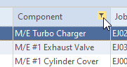
The filter feature can be used for easily selecting specific data in the shown data list. The feature can be accessed by moving the mouse to a column header and clicking on the filter icon.
After clicking the filter symbol a selection list appears that allows you to define what data are to be shown in the grid.
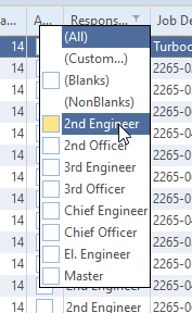
- (All) - all values will be shown
- (Custom) - a custom selection will be shown as described in "by custom filtering"
- (Blanks) - selects all rows having no data/values
- (NonBlanks) - hides all rows where the specific column doesn't have any data/values
- The rest of the list allows shows the available selection criteria. Multiple entries can be selected.
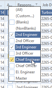
The grid will be updated immediately.
After applying a filter, the selection filter options will be shown in the lower left corner of the grid.
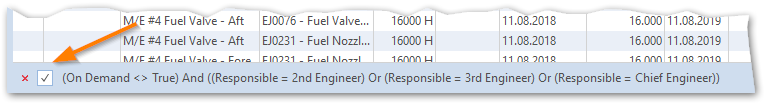
- Clicking on the "X" will remove the filter.
- Via the checkbox the active filter can be temporarily disabled and enabled again.
- The
Customize ...button in the lower right corner of the grid allows a more detailed definition of the active filter.
#
Custom Filters
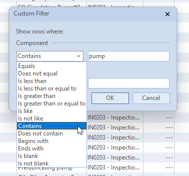
A more detailed filtering can be performed by using custom filters. The creation of custom filter can be started either by using the (Custom) option when clicking on the filter icon on the column header or - for already active filters - using the Customize ... button in the lower right corner of the grid.
If you would like to display for example all components that contain "pump" you could either use filtering by selection as described above or you can use custom filtering.
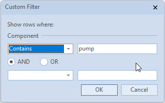
In this case all components will be shown that contain the text "pump" somewhere in the components name.
"%" and "_" are so called wildcards representing one (_) ore more (%) characters.
There are many other options available for creating custom filters like combining different filter criteria, comparing values etc.. But those additional options are not part of this document.
#
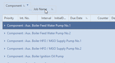
Groups
Data shown in a data grid can be grouped in two ways:
#
Drag & Drop Grouping
If the header area shows an extra area labeled "Drag a column header here to group by that column", data can be grouped dragging and dropping the column header of a column to be grouped into the area showing this label.
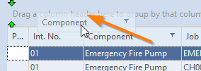
A group can have sub-groups by dragging & dropping more columns into the grouping area.
#
Group via Customization Menu
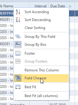
Another possibility is the right-click on the column header. If available, the following menu will appear.
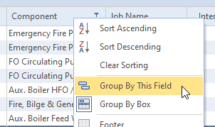
Use Group by this field for grouping the data by the selected column.
#
Rearrange
If the column sequence isn't in a suitable order you can easily rearrange order by picking the column header with left mouse and moving it to the correct position. The available options are similar to features found in many Microsoft Office applications.
#
Hiding Columns
To hide a column drag selected column in the right lower area of the grid.

Another possibility is the right click on the column header. if available the following menu will appear.
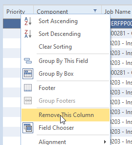
The column can be removed by clicking on Remove This Column.
#
Field Chooser
Some data grids may not show all available data at the beginning. In some cases additional columns might be available that are hidden in the initial configuration of the grid.
If additional columns exist, the Field Chooser can be used for adding additional columns to the grid. For accessing the Field Chooser, right-click on a column header and choose Field Chooser from the menu.
Via the field chooser you have access to hidden or additional columns.
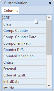
Drag the column to be added to the header area of the grid and drop it at the desired position.
#
Print, Export
The sharing of content currently shown in the data grid is available via the Share button. The Share button allows you to to save the grid to a file (xlsx, xls, html, xml) or send it to a printer.
#
Managing Grid Layouts
Customized grid layouts can be save for later use.
Saved grid layouts are also replicated via the database replication module. A grid layout created and saved in office will be available to the same user when using the system on board of a vessel.
#
Save
You can save the layout adjustments by using button Grid Layout -> Save. Hit New and enter a meaningful name.
User name and creation date of layout will be stored in the database.
#
Load
You can load your own layout by using button Grid Layout -> Load. Select the desired layout from the list and grid layout will be updated. The selected layout remains until the end of the session or until a new layout is loaded.